
I find it most irritating to look at all those badly done Arabic versions of there Latin counterparts. The lack of attention given to detail that will in some cases even make the Arabic logo stronger than their Latin original. As graphic designers and visual communicators we need to step up and start working harder to strengthen the Arab script visual identity.
We can no longer say that the market knows no better… That is an excuse for either our lack of time, …ability, or effort. Nothing more In this article we will attempt to high light only a few points that maybe able to help us achieve this. To do this we have to start from the beginning. So be fore starting with anything, lets quickly recap a little history of the Arabic script and its rules. Some History: Arabic script includes many languages and it is the second most commonly used script after Latin. It includes 28 basic letters, and is the only script that still uses its vocalisation marks as a means to different at some words from others. It also includes countries such as Afghanistan, Arab countries, Iran, Pakistan, Tajikistan, Turkmenistan, and Indian regions where .the Pashtu language is used Islamic calligraphy mainly became an art during the Islamic empire, not only because of religious belief, but also due to the weight the calligrapher felt when writing the “word” of God. A calligrapher by the name of ‘Ibn Muqla’ was the first to perfect Islamic calligraphy by creating proportions and standardising Arabic let.“ters. It was called the “Alif Module.
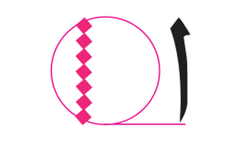
Three elements were needed for the ‘Alif Module” ;to work the rhombic dot (1 a circle (2 .‘the ‘Alif (3 The diameter of the circle was determined by the length of the Alif. The width of the Alif was the diameter of the rhombic dot. Based on how many rhombic dots it took to make the Alif length, all the remaining letters fit proportionally in that module. The size of the pen was determined by how the calligrapher cut his reed (the thickness of the pen used), and by the pressure he applied when writing. Each script in Arabic had its own proportions and measurements. Using the rhombic dots you can .then draw each letter accurately

image of another letter with rhombic dot and) (circle. maybe another script also Islamic calligraphy branches out into two different style; cursive and geometric. The geometric based script is called Kufic has several variations and is considered the oldest of the scripts. The six cursive scripts are; Thuluth, Naski, Riqaa, Taliq, Di wani, and Muhaqqaq.
There are several other scripts and even more styles of scripts (which are a bit like effects you can add or apply to the script itself). Keep in mind that the rules and the proportions of each of these scripts are different and work only for that specific script. Now that we understand only a little of the rules of Arabic calligraphy, we can start to understand how …to look at Arabic Latin adaptation NINA KREIDIE Graphic Design GRAPHIC ARTIST Islamic calligraphy mainly“ became an art during the Islamic empire, not only because of religious belief, but also due to the weight the calligrapher felt when writing the .
“word“ of God6 REVIEWS GRAPHICSAs we have mentioned above, Islamic calligra phy has many different scripts, each with its own beauty. For example Thuluth was mainly used for headlines particularly Thuluth Jali. Naski was for body text, Riqaa is a bolder form of script. Diwani was only used for Turkish official documents, etc. So depending on the font’s use, for example for a font that is meant for display or geometric, you would want to choose Kufic as your base or measurement. Diwani is usually a suitable to use for Latin script or calligraphic fonts. For body text, Naski would be more appropriate.

Tips: One of the greatest mistake most designers make when Arabizing a Latin logo, is the lack respect that is given to both forms of calligraphic rules. Letters are randomly rotated, and scaled, ignoring all rules and proportions, making the Arabization of the logo poor. In some cases the overall ‘feel’ or concept behind the logo is ignored, or ‘lost in translation’. For example, in some cases no attention is given to the stress of the axis or the counter part weight. Kerning (as well as the Kashida) and leading are also curial and must be given proper .attention A few basic crucial points to look into while designing are the following x-Height In Arabic there is no X-height. There is a tooth .height and a loop height insert image of what is tooth height and loop* height This part is a little tricky. But based on this you can get all the letters right. After setting your base line, you then have to determine if you are going to have varying tooth heights, or one height set for all. This can apply also for the loop heights, ascender heights, and descender heights. It is up to the designer to set his/her height based on the Latin, and the Arabic script’s measurements. Although the ascender and descender heights vary in Arabic, the designer can choose to set some at the same height to help bring it closer to the Latin logo.

Counterpart Also something commonly ignored is how the counterpart of the glyph is working. Remember when Arabizing a Latin font, or designing your own Arabic font you must stick to the basic guidelines and proportions. If the Latin has large counterparts then the Arabic must also have proportionally large .counterpart space.